Principal Component Analysis
This presentation was made as a brief introduction to PCA to new members of the Albeck Lab.
Welcome to a brief tutorial on how to conduct a standard PCA in matlab using featureized single-cell traces.
This dataset was created by live-cell ERK biosensor imaging of three cell types responding to Epidermal Growth Factor (EGF), Amphiregulin (AREG) or the control (Imaging Media).
PCA, or Principal Component Analysis, is a dimensionality reduction technique widely used in machine learning and data analysis. The primary goal is to transform high-dimensional data into a new coordinate system (i.e., a new set of variables), called principal components, where the data’s variance is maximized along the principal axes. This transformation allows for a more efficient representation of the data while retaining its essential features (dimensionality reduction).
For more details on the math behind PCA, here’s a great video from stat quest: https://www.youtube.com/watch?v=FgakZw6K1QQ
The main function used in this tutorial is called PCApl (Princple Component Analysis Pipeline). It will conduct all the necessary steps for us and output three graphs for us to analysize.
Single-cell traces will be “featurized” into different characteristics which make up the columns of the data. Each row is a single cell.
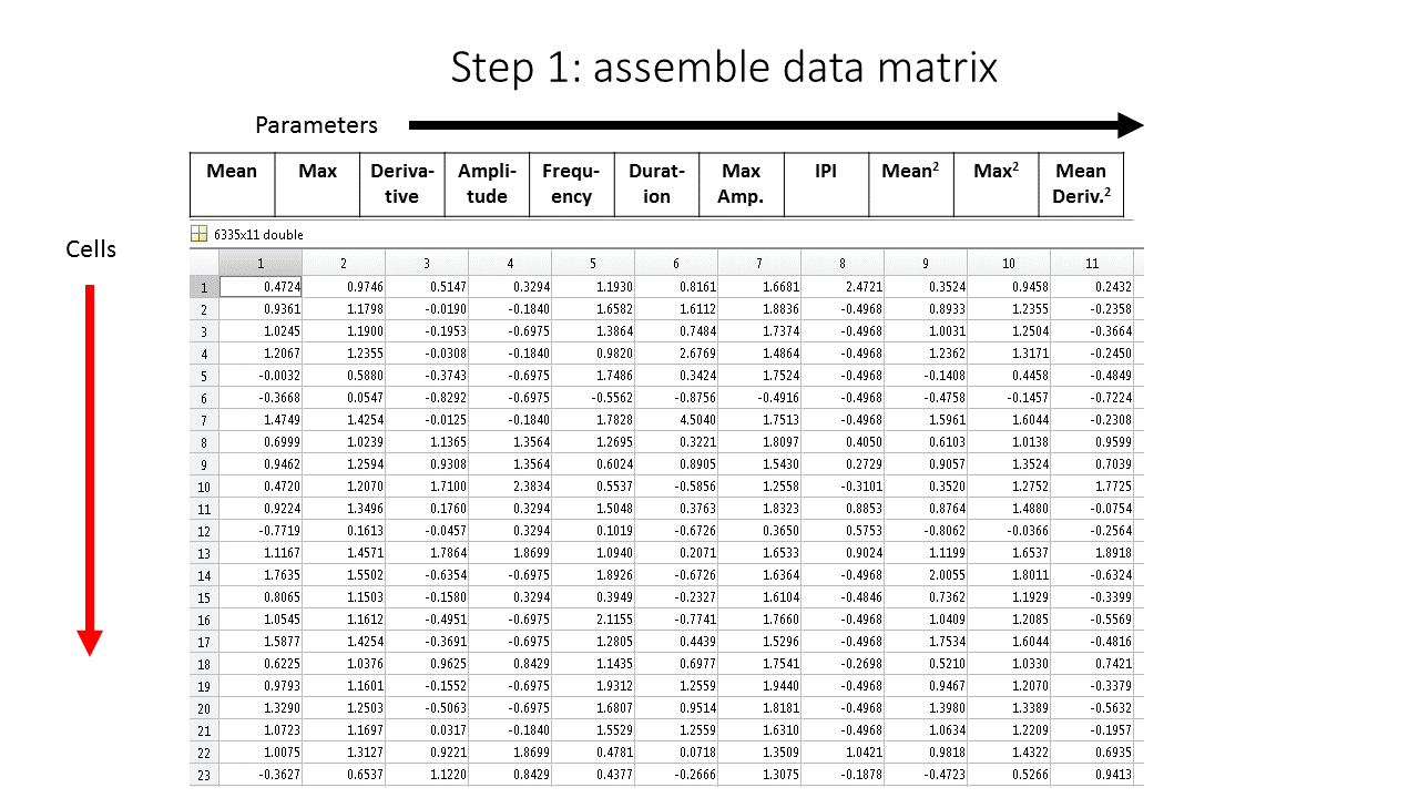
Each column represents a distinct features of the ERK biosensor.
One thing to remember is the function will standardize the data. It allows for comparison of the parameters.
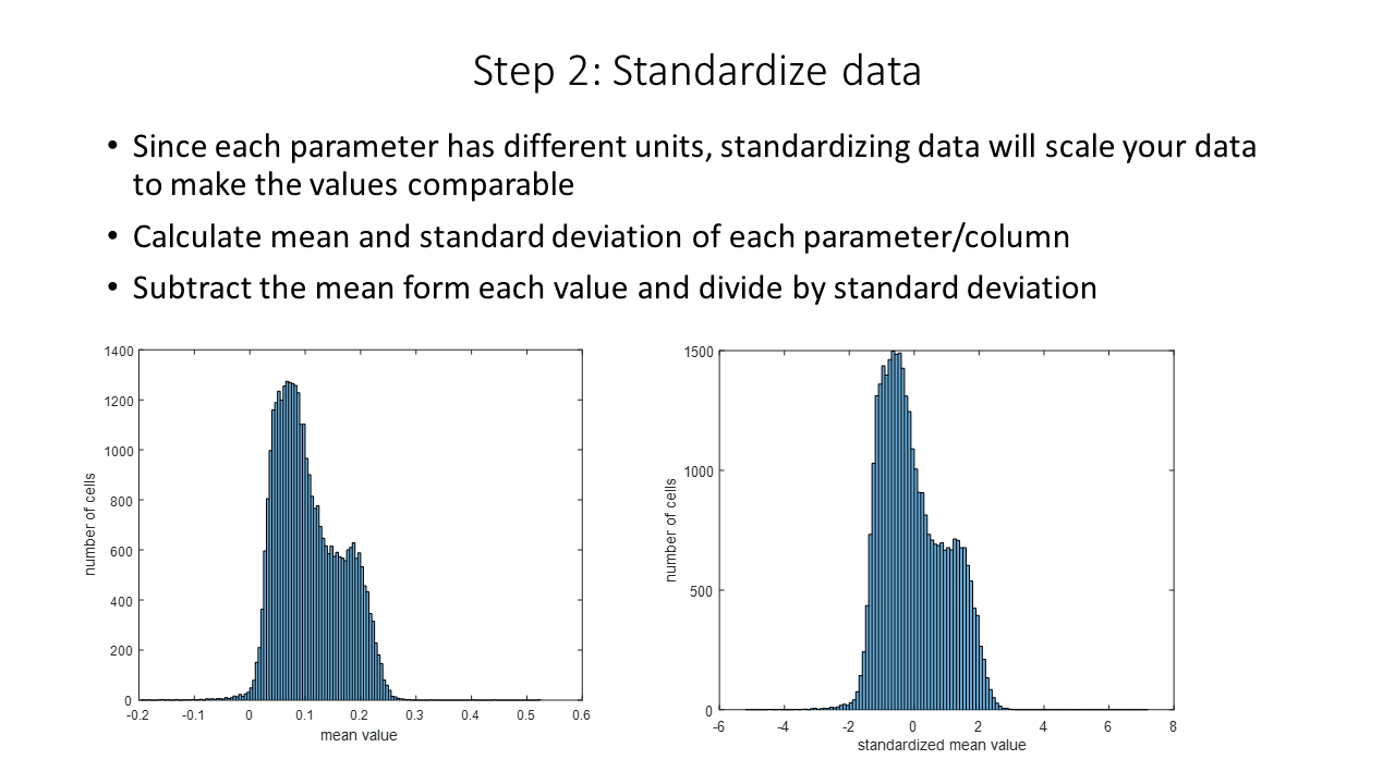
Notice that standardization does not change the distribution.
Now we are ready to the the princple component analysis using PCApl It has several figure outputs which we will be looking at.
PCApl(data)
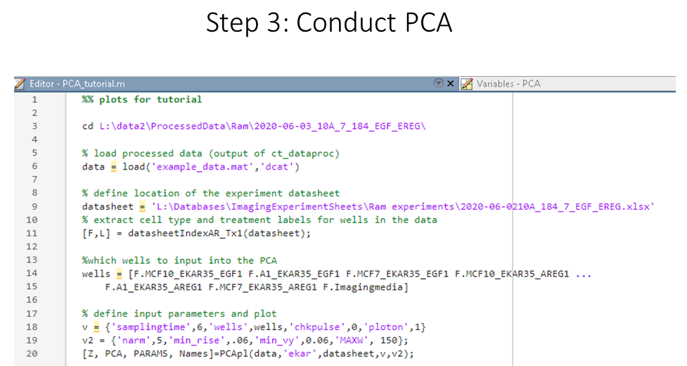
example usage with basic input parameters
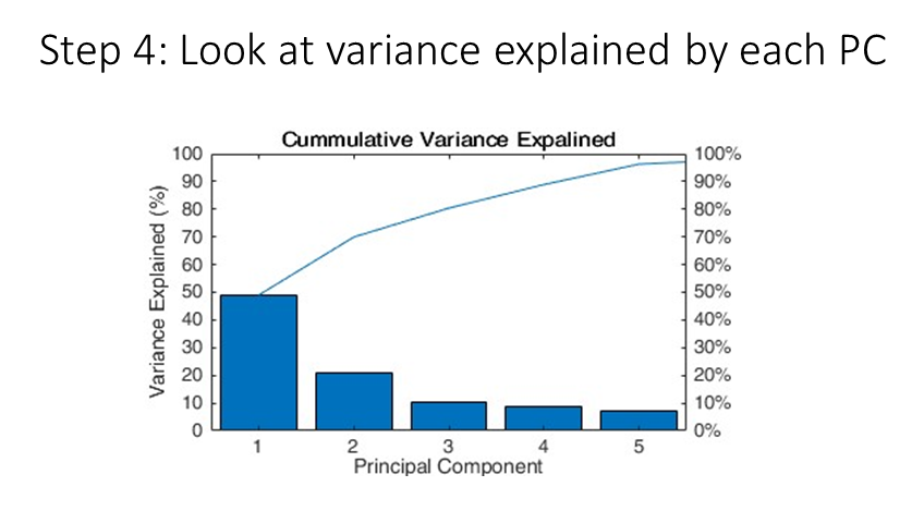
Next, we look at the “pareto” plot, to see how much variance is explained by the principle components. We see that, the first PC explains ~50% of the varaince, which is very good for our data! This means that about half of the variation in our single-cell ERK data can be explain by a single component.
We can gain an intuition about how each princple component is made by looking at the loadings output. Here we see that the first principle component as the overall ERK response to stimulation by EGF.
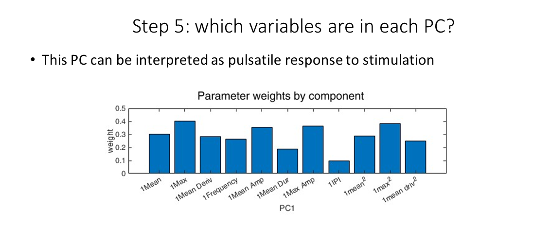
PC1 loadings
We can do the same with PC2 (and so on), seeing that the second principle componenent is the pulsatility of the resopnse to the ligand.
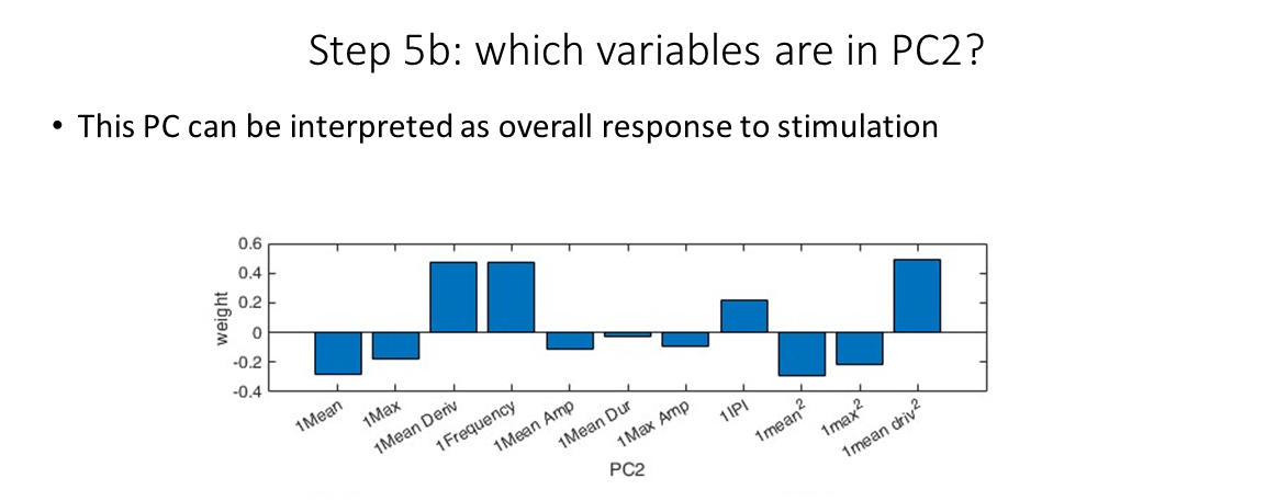
PC2 loadings
Finally, we can use the scores output to visualize the data in PC space. By coloring each plot by different groupings, we can find patterns in the data. For example, we see that each cell type have somewhat unique responses profiles (left), and the ligands themselves also have unique profiles!
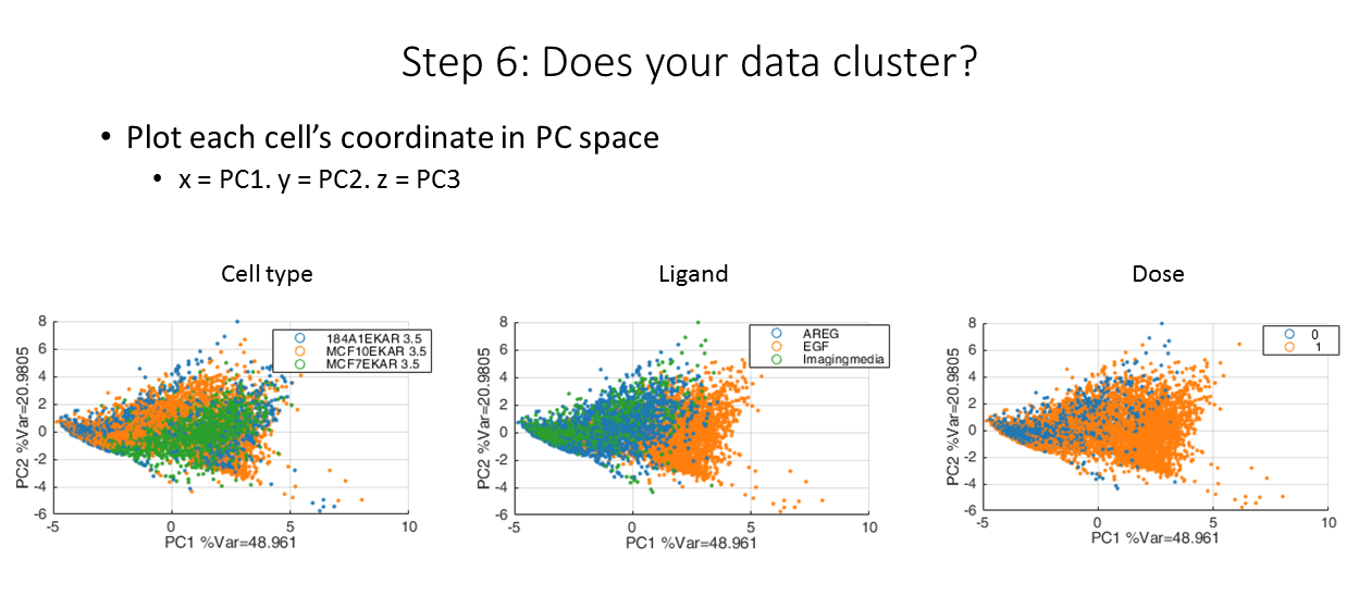
Our data in reduced dimensions!
Code Availability