MCF10A RNA sequencing
Analysis of MCF10A in 16 different conditions 2 biological replicates per sample. Note that we would ideally need at least three replicates for a standard analysis.
After running STAR alignment, one of the outputs will be the raw counts per gene in each sample. We will use DESeq2 to detect differentially expressed genes.
A key aspect of analysis involves quantifying and statistically inferring systematic changes between conditions, contrasting them with within-condition variability. DESeq2, a software package, employs negative binomial generalized linear models to assess differential expression. The estimates of dispersion and logarithmic fold changes integrate data-driven prior distributions.
More information about the DESeq workflow can be found at: https://bioconductor.org/packages/devel/bioc/vignettes/DESeq2/inst/doc/DESeq2.html Love, M.I., Huber, W., Anders, S. (2014) Moderated estimation of fold change and dispersion for RNA-seq data with DESeq2. Genome Biology, 15:550. 10.1186/s13059-014-0550-8
DESeq2
First, we create a DESEQDataSet Object. You must have a count matrix called counts, and table of sample information called coldata. The design indicates how to model the samples, here, that we want to measure the effect of the condition, controlling for replicate differences.
# Create a DESeq object
dds <- DESeqDataSetFromMatrix(countData = counts, colData = coldata, design = ~condition)
# Specify reference level to imaging media
dds$condition <- relevel(dds$condition, "IM")
Now we are ready to run the main DESeq funciion which will perform differential expression analysis.
# Definitions;
#estimateSizeFactors
#This calculates the relative library depth of each sample
#estimateDispersions
#estimates the dispersion of counts for each gene
#nbinomWaldTest
#calculates the significance of coefficients in a Negative Binomial GLM using the size and dispersion outputs
dds <- DESeq(dds)
#save the output
saveRDS(dds, file = "./data_output/All_vs_IM_dds.rds")
# Display size factors for normalization
sizeFactors(dds) %>%
knitr::kable()
# Plotting dispersion estimates is crucial in genomics to assess data variability and serve as a good quality control step.
plotDispEsts(dds) # verifies normalization,
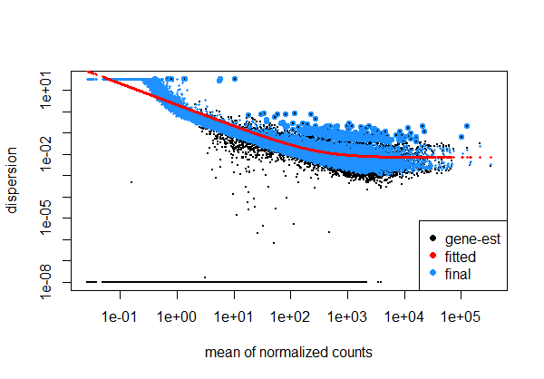
Here we see a good looking dispersion plot. It shows consistent dispersion across a range of expression levels, without pronounced patterns or trends. It suggests that the assumed model for variability appropriately captures the inherent variation in gene expression, ensuring reliable statistical tests for differential expression. Consistency in dispersion is essential for accurate identification of differentially expressed genes and indicates a well-controlled experimental design!
PCA and batch correction
Next, we get an intuition about our experiment by reducing the dimensions of our data using princple component analysis. This will help visualize treatments which have similar expression patterns. We can color the plot by the treatmnets or replicate groups.
# Use variance stabilizing transformations (VST) to produce transformed data on the log2 scale which has been normalized with respect to library size or other normalization factors.
rld <- vst(dds)
p1 <- plotPCA(rld,intgroup="condition") +
geom_text_repel(max.overlaps = 15,
                box.padding = 0.25,
                segment.color = 'grey50',
                fontface = "italic",
                label = rld$condition)+
labs(title = 'PCA per condition')

p2 <- plotPCA(rld,intgroup="replicate") +
geom_text_repel(max.overlaps = 15,
                box.padding = 0.25,
                segment.color = 'grey50',
                fontface = "italic",
                label = rld$replicate)+
labs(title = 'PCA per condition')

plot_grid(p1, p2, ncol = 2, align = "hv")
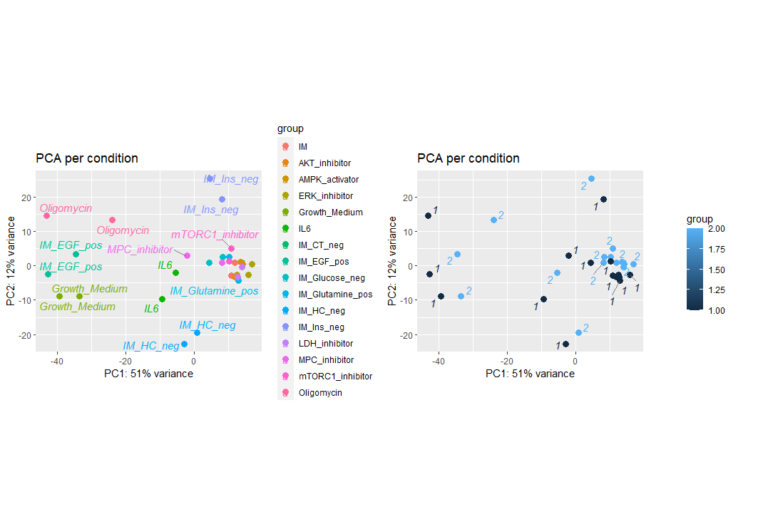
PCA plot
On the left plot, we see that oligomycin, Imaging media without Insulin, Imaging media without Hydrocortisone, Imaging media with EGF, and IL6 treatments are well separated from the larger cluster of treatments. This suggests that the aforementions treatments have unqiue expression patterns. On the right plot, we colored by replicate and it suggests that we may have a batch effect. To correct for this batch effect, we can use the removeBatchEffect function from the limma package
# Removing batch effect
# Perform variance stabilizing transformation
vsd = vst(dds)
# Create a copy of the VSD for later use or reference
vsd1 = vsd
# Use the limma package's removeBatchEffect function to remove batch effects
# The batch information is assumed to be stored in vsd$replicate
# This function will adjust for batch effects in the expression data
assay(vsd1) <- limma::removeBatchEffect(assay(vsd), vsd$replicate)

# Create a PCA plot for non-batch corrected data, colored by replicate
p5 <- plotPCA(vsd,intgroup="replicate") +
geom_text_repel(max.overlaps = 15,
                box.padding = 0.25,
                segment.color = 'grey50',
                fontface = "italic",
                label = vsd$replicate)+
labs(title = 'Completed data: PCA not corrected')

# Create a PCA plot for batch corrected data, colored by replicate
p6 <- plotPCA(vsd1,intgroup="replicate") +
geom_text_repel(max.overlaps = 15,
                box.padding = 0.25,
                segment.color = 'grey50',
                fontface = "italic",
                label = vsd1$replicate)+
labs(title = 'Completed data: PCA corrected')

plot_grid(p5, p6,ncol = 2, align = "hv")
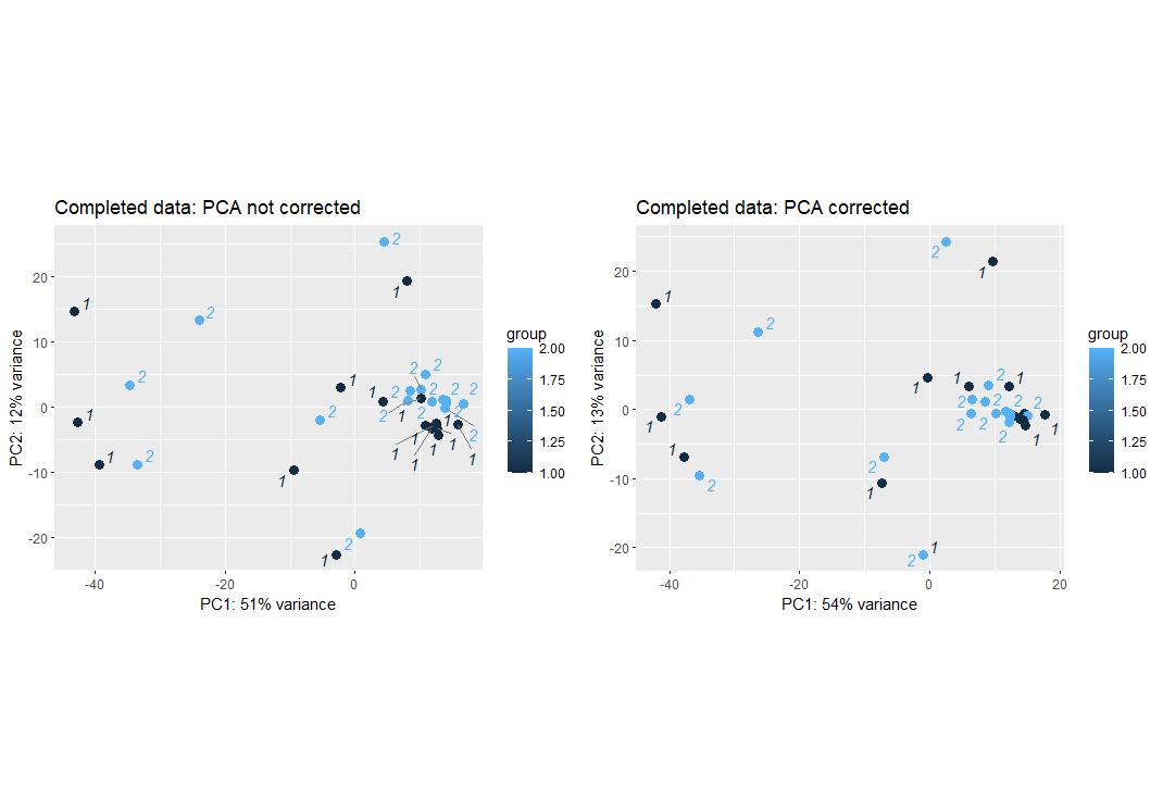
After correcting for the batch effect, we see that the replicate treatments are slightly closer to each other. Note that some are still far apart which suggests those two similar treatments were indeed have dis-similar gene expression.
Distance matrix
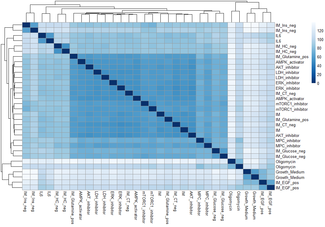
To further visualize the similarities and differences between treatments, we compute a distance matrix based on the euclidian distance between each sample with another. This provides a visual representation of sample relationships in the gene expression data. The heatmap allows us to quickly assess the overall structure of the data..
# Crease a new vsd variable and perform variance stabilizing transformation
vsd = vst(dds)
# Checking sample similarity
# Calculate pairwise distances between samples based on the transformed expression data
sampleDists <- dist(t(assay(vsd)))
# Convert the distance matrix to a symmetric matrix
sampleDistMatrix <- as.matrix(sampleDists)
# Assign condition labels to rows and columns based on the 'condition' column in 'vsd'
rownames(sampleDistMatrix) <- paste(vsd$condition, sep="-")
colnames(sampleDistMatrix) <- paste(vsd$condition, sep="-")
# Define a color palette for the heatmap using the 'Blues' color scheme
colors <- colorRampPalette(rev(brewer.pal(9, "Blues")) )(255)
# Create a heatmap of the sample distances with hierarchical clustering
pheatmap(sampleDistMatrix,
     clustering_distance_rows=sampleDists,
     clustering_distance_cols=sampleDists,
     col=colors)
Differential expression analysis
Next, we can compare how specific genes are differentially expressed between to treatments. To do this, we use volcano plots.
A volcano plot is a graphical representation commonly used to visualize the results of statistical tests for differential gene expression. In a volcano plot, each point represents a gene, and the x-axis typically shows the fold change in gene expression between experimental conditions, while the y-axis shows the statistical significance (e.g., p-value) of the change. Genes with high fold changes and high significance are often found in the “tail” of the volcano, resembling a volcano’s eruption. We will look for points that are significantly up- or downregulated (located far from the center along the x-axis) and considering their statistical significance (distance along the y-axis).
Firstly, we are interested to find which genes are differntially regulated with Oligomycin treatment. Oligomycin is an inhibitor of ATP synthase, which will inhibit oxidative phosphorylation.
# Obtain differential expression results from DESeqDataSet 'dds' for the comparison "Oligomycin vs IM"
res <- results(dds, name = "condition_Oligomycin_vs_IM")
# Convert the results to a tibble (data frame) with row names specified as 'ensembl'
res_tbl <- as_tibble(res, rownames="ensembl")

# Import annotation file
ensembl_to_geneName <- readRDS("./data/hsapiens_annotations_230510.rds") %>%
filter(!duplicated(gene, drop = F))

# Add gene names and entrez id to your results. Use left_join to merge gene names and entrez id from ensembl_to_geneName to the result table
res_tbl <- res_tbl %>%
left_join(ensembl_to_geneName) %>%
arrange(padj)

# Create two data frames: one for genes overexpressed and one for genes underexpressed. We set a significance threshold of 0.5 and a log2 fold change of +- 1.
overexpr <- res_tbl %>% filter(padj<=0.05 & log2FoldChange>=1)
underexpr <- res_tbl %>% filter(padj<=0.05 & log2FoldChange<=-1)
signif <- full_join(overexpr, underexpr)

# Volcano plot
# Filter out rows with NA values in the 'padj' column
p1 = res_tbl %>%
filter(!is.na(padj)) %>%

# Create a ggplot object with specified aesthetics
ggplot(aes(x = log2FoldChange, y = -log10(padj),
            color = padj < 0.05 & abs(log2FoldChange) > 1,
            label = ifelse(padj<0.05&log2FoldChange>=1|
                            padj<0.05&log2FoldChange<=-1,as.character(gene),''))) +

# Manually set color values for significantly expressed genes
scale_colour_manual(values = c("gray", "firebrick3")) +

# Set labels for the color legend
labs(col="Significantly expressed") +

# Add points to the plot
geom_point(size = 0.5) +

# Add a horizontal line at -log10(0.05) for visual reference of significance threshold
geom_hline(yintercept = -log10(0.05)) +

# Add vertical lines at log2FoldChange = 1 and log2FoldChange = -1
geom_vline(xintercept = 1) +
geom_vline(xintercept = -1) +

# Add labels to the points using 'geom_text_repel' from the 'ggrepel' package
geom_text_repel(max.overlaps = 20,
                box.padding = 0.25,
                segment.color = 'grey50',
                fontface = "italic") +

# Set the title of the plot
labs(title = "Oligomycin_vs_IM") +
# Set the theme to a simple black and white theme
theme_bw()
# Print the plot
print(p1)
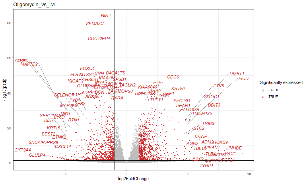
Here we see many genes that are downregulated: RIN2, SEMA3C, CDC42Ep4, IQGAP2 etc. We also see many genes that are upregulated: CDC6, ETV5. DMBT1. E2F7 etc.
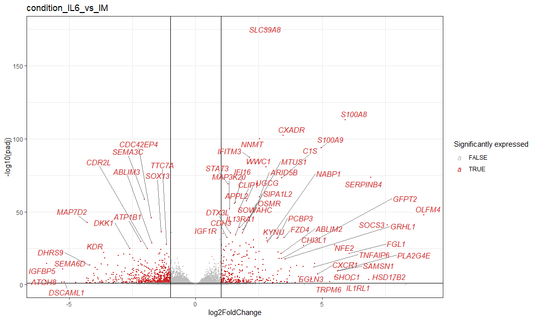
Another condition of interest is the IL6 treatment, which is a pro-inflammatory cytokine, lets look at the volcano plot for that treatment.
code not shown
These results are very interesting! We see that stat3 is upreulated which is a good positive control, Interestingly CXCR1 is upregulated, which is a receptor for IL8.
GSEA
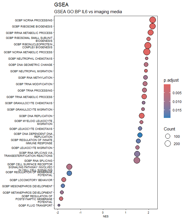
Gene Set Enrichment Analysis (GSEA) is a computational method in bioinformatics that assesses whether a predefined set of genes, representing specific biological functions or pathways, is statistically overrepresented in a ranked list of genes derived from experimental data, such as gene expression profiles. By examining the distribution of these gene sets in relation to their expected random distribution, GSEA helps identify biologically relevant patterns and provides insights into the functional significance of gene expression changes in different biological conditions.
Acknowledgements
Thank you to Marion Hardy, a talented bioninformatician, for teaching me these techniques! (https://github.com/marionhardy)